

缘起
项目中需要实现如下图的色卡(不知道叫啥名字,搜了一圈也没搜到,想到初中化学有个 PH 比色卡 ,我们就姑且就叫它“色卡”吧)效果,上半部分透明,下半部分有颜色。嗯,对,就是这么简单。

实现思路
- 方案1
使用 ViewGroup (比如:ConstraintLayout 套在最外层,然后里面一个 TextView 和两个用于设置背景色的 View)
<androidx.constraintlayout.widget.ConstraintLayout
        android:layout_width="wrap_content"
        android:layout_height="wrap_content">

        <View
            android:id="@+id/v_top"
            android:layout_width="0px"
            android:layout_height="0px"
            android:background="#00FFFFFF"
            app:layout_constraintBottom_toTopOf="@id/v_bottom"
            app:layout_constraintEnd_toEndOf="parent"
            app:layout_constraintStart_toStartOf="parent"
            app:layout_constraintTop_toTopOf="parent"
            app:layout_constraintVertical_bias="0" />

        <View
            android:id="@+id/v_bottom"
            android:layout_width="0px"
            android:layout_height="0px"
            android:background="#FF7029"
            app:layout_constraintBottom_toBottomOf="parent"
            app:layout_constraintEnd_toEndOf="parent"
            app:layout_constraintStart_toStartOf="parent"
            app:layout_constraintTop_toBottomOf="@id/v_top"
            app:layout_constraintVertical_bias="1" />

        <TextView
            android:layout_width="wrap_content"
            android:layout_height="wrap_content"
            android:text="简介"
            android:textColor="@color/white"
            app:layout_constraintBottom_toBottomOf="parent"
            app:layout_constraintEnd_toEndOf="parent"
            app:layout_constraintStart_toStartOf="parent"
            app:layout_constraintTop_toTopOf="parent" />

    </androidx.constraintlayout.widget.ConstraintLayout>
- 方案2
写一个 layer-list 的 xml 文件(放在 drawable 目录下)
<?xml version="1.0" encoding="utf-8"?>
<layer-list xmlns:android="http://schemas.android.com/apk/res/android">

    <!-- 阴影层 -->
    <item>
        <shape android:shape="rectangle">
            <solid android:color="#FF7029" />
            <size
                android:width="32dp"
                android:height="22dp" />
        </shape>

    </item>

    <!-- 白色层 -->
    <item android:bottom="12dp">
        <shape android:shape="rectangle">
            <solid android:color="@color/white" />
        </shape>
    </item>

</layer-list>
然后,设置为 TextView 的 background
<TextView
        android:layout_width="wrap_content"
        android:layout_height="wrap_content"
        android:layout_marginVertical="40dp"
        android:background="@drawable/ic_half_color_bg"
        android:gravity="center"
        android:text="简介"
        android:textColor="@color/white" />
Tips:白色层如果想设置为透明的话,那么最终结果将是 阴影层 占满整个 background ,所以想要实现“透明”效果的话,需要设置为父布局一样的背景色(因为我们是视觉上的”伪透明“,如果不是纯色背景的话看起来就会很奇怪了)。
- 方案3
自定义 TextView
class HalfColorTextView @JvmOverloads constructor(
    context: Context, attrs: AttributeSet? = null
) : AppCompatTextView(context, attrs) {

    private val mPaint = Paint(Paint.ANTI_ALIAS_FLAG)

    override fun onDraw(canvas: Canvas?) {
        // 需要在父类默认实现前调用,否则我们绘制的内容将被盖住
        canvas?.let {
            mPaint.color = Color.TRANSPARENT
            canvas.drawRect(0f, 0f, width * 1f, height / 2f, mPaint)
            mPaint.color = Color.parseColor("#FF7029")
            canvas.drawRect(0f, height / 2f, width * 1f, height * 1f, mPaint)
        }
        super.onDraw(canvas)
    }
}
然后在 xml 布局中将普通的 TextView 替换为 包名.HalfColorTextView 使用即可,如
<com.example.demo.widget.HalfColorTextView
        android:layout_width="wrap_content"
        android:layout_height="wrap_content"
        android:text="简介"
        android:textColor="@color/white" />
- 方案4
/**
 * 半色 Drawable,topColor 为上半部分的颜色值,bottomColor 为下半部分的颜色值。
 */
class HalfColorDrawable(@ColorInt val topColor: Int = Color.TRANSPARENT, @ColorInt val bottomColor: Int = Color.parseColor("#FF7029")) :
    Drawable() {

    private val mPaint = Paint(Paint.ANTI_ALIAS_FLAG)

    override fun draw(canvas: Canvas) {
        val r = bounds
        val width = r.width()
        val height = r.height()
        mPaint.color = topColor
        canvas.drawRect(0f, 0f, width * 1f, height / 2f, mPaint)
        mPaint.color = bottomColor
        canvas.drawRect(0f, height / 2f, width * 1f, height * 1f, mPaint)
    }

    override fun setAlpha(alpha: Int) {
        mPaint.alpha = alpha
        invalidateSelf()
    }

    override fun setColorFilter(colorFilter: ColorFilter?) {
        mPaint.colorFilter = colorFilter
        invalidateSelf()
    }

    @Deprecated("Deprecated in Java", ReplaceWith("PixelFormat.TRANSLUCENT", "android.graphics.PixelFormat"))
    override fun getOpacity(): Int = PixelFormat.TRANSLUCENT
}
使用方式
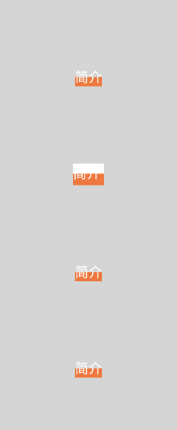
textView.background = HalfColorDrawable()
效果图
小结
以上 4 种方案中,除了第 2 种,其余 3种方案都能实现上半部分透明,下半部分纯色的效果。
方案1:
- 需要编写大量的 xml 布局代码
- 使用了 4个 View 来实现效果(多了 4 个 View 的布局、测量、绘制)
方案2:
- 无法设置上下的比例,只能通过设置具体的宽高来实现
- 由于我们在 xml 中设置了具体的宽高,所以我们在使用时需要将 TextView 的 gravity 属性设置为 center,否则显示效果可能无法达到我们的预期
- 上半部分无法实现真正的透明,在背景复杂的父控件中时效果将会很怪异
- 无法动态设置上下两部分的颜色,如果需要别的颜色组合,需要重新写一个 xml 布局
方案3:
- 在使用的地方需要替换为我们的自定义 TextView,如果本来就是一个自定义的 TextView 而且是 final 类型的,那么就没法玩了
方案4:
- 无法在 xml 布局中设置 background
缘灭
Code
/**
 * 多色 Drawable,可设置填充方向 LinearLayoutCompat.HORIZONTAL or LinearLayoutCompat.VERTICAL,默认为 LinearLayoutCompat.VERTICAL 。
 */
class MultiColorDrawable(@ColorInt val colorArr: Array<Int>) : Drawable() {

    private val mPaint = Paint(Paint.ANTI_ALIAS_FLAG)

    @ExportedProperty(category = "measurement")
    private var mOrientation = LinearLayoutCompat.VERTICAL

    /**
     * Should the layout be a column or a row.
     * @param orientation Pass [.HORIZONTAL] or [.VERTICAL]. Default
     * value is [.VERTICAL].
     */
    fun setOrientation(@LinearLayoutCompat.OrientationMode orientation: Int) {
        if (mOrientation != orientation) {
            mOrientation = orientation
            invalidateSelf()
        }
    }

    /**
     * Returns the current orientation.
     *
     * @return either [.HORIZONTAL] or [.VERTICAL]
     */
    @LinearLayoutCompat.OrientationMode
    @InspectableProperty(
        enumMapping = [InspectableProperty.EnumEntry(
            value = LinearLayout.HORIZONTAL,
            name = "horizontal"
        ), InspectableProperty.EnumEntry(value = LinearLayout.VERTICAL, name = "vertical")]
    )
    fun getOrientation(): Int {
        return mOrientation
    }

    override fun draw(canvas: Canvas) {
        val r = bounds
        val width = r.width()
        val height = r.height()
        val count = colorArr.count()
        if (getOrientation() == LinearLayoutCompat.VERTICAL) {
            drawVerticalStyle(canvas, width, height, count)
        } else {
            drawHorizontalStyle(canvas, width, height, count)
        }
    }

    private fun drawHorizontalStyle(canvas: Canvas, width: Int, height: Int, count: Int) {
        colorArr.forEachIndexed { index, color ->
            mPaint.color = color
            canvas.drawRect(width * ((index * 1f) / count), 0f, width * ((index + 1f) / count), height * 1f, mPaint)
        }
    }

    private fun drawVerticalStyle(canvas: Canvas, width: Int, height: Int, count: Int) {
        colorArr.forEachIndexed { index, color ->
            mPaint.color = color
            canvas.drawRect(0f, height * ((index * 1f) / count), width * 1f, height * ((index + 1f) / count), mPaint)
        }
    }

    override fun setAlpha(alpha: Int) {
        mPaint.alpha = alpha
        invalidateSelf()
    }

    override fun setColorFilter(colorFilter: ColorFilter?) {
        mPaint.colorFilter = colorFilter
        invalidateSelf()
    }

    override fun getOpacity(): Int = PixelFormat.TRANSLUCENT
}
使用方式
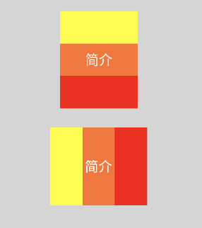
tvVerHalfColorDrawable.background = MulticolorDrawable(arrayOf(Color.YELLOW, Color.parseColor("#FF7029"), Color.RED)).apply {
                setOrientation(LinearLayoutCompat.VERTICAL)
            }
tvOriHalfColorDrawable.background = MulticolorDrawable(arrayOf(Color.YELLOW, Color.parseColor("#FF7029"), Color.RED)).apply {
                setOrientation(LinearLayoutCompat.HORIZONTAL)
            }
可以看到,我们针对 方案4 进行了优化,现在我们的自定义 drawable 支持设置多个颜色,可以按照比例进行绘制,而且可以支持横向和纵向的绘制。
Tips:如果想实现在 xml 布局中设置颜色属性的话,你可以考虑自定义一个 ViewGroup ,将从 xml 中获取的属性设置给 MultiColorDrawable,然后通过 setBackground 方法设置给我们自定义的 ViewGroup 即可。
最终效果图
总结
有时候我们在实现一些效果时,并不一定需要使用自定义 View,我们也可以通过自定义 drawable 来实现。
又是一个安卓开发小技巧,你学废了吗?
如果对你有帮助的话,欢迎一键三连+关注哦~