Vue3,实现biu~biu~biu~的效果
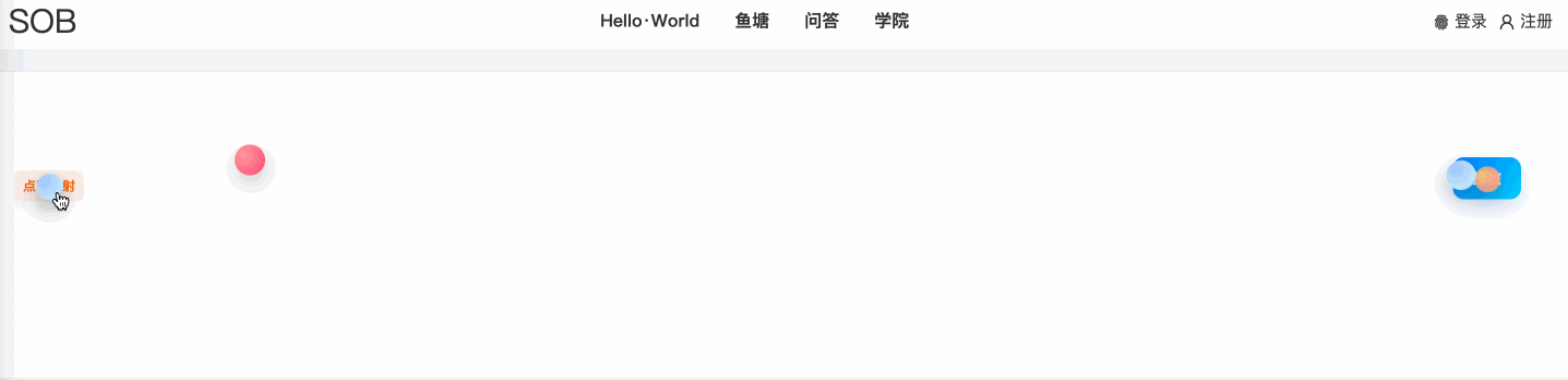
效果如何呢?请看VCR
代码
<template>
  <div class="container" ref="containerRef">
    <div ref="leftTextRef" class="left-text" @click="shoot">点我发射</div>

    <button
        ref="targetBtn"
        class="target-btn"
        :class="{ flash: isFlashing }"
    >
      接收
    </button>
    <div
        v-for="b in bullets"
        :key="b.id"
        class="bullet"
        :style="bulletStyle(b)"
    ></div>
  </div>
</template>

<script setup>
import { ref, onBeforeUnmount } from 'vue'

const containerRef = ref(null)
const leftTextRef = ref(null)
const targetBtn = ref(null)

const bullets = ref([])
let idCounter = 0
const isFlashing = ref(false)

const rafIds = new Set()
let flashTimeout = null

const easeOutCubic = (t) => 1 - Math.pow(1 - t, 3)

const shoot = () => {
  if (!containerRef.value || !leftTextRef.value || !targetBtn.value) return

  const cr = containerRef.value.getBoundingClientRect()
  const sr = leftTextRef.value.getBoundingClientRect()
  const tr = targetBtn.value.getBoundingClientRect()

  const start = {
    x: sr.left - cr.left + sr.width / 2,
    y: sr.top - cr.top + sr.height / 2
  }
  const end = {
    x: tr.left - cr.left + tr.width / 2,
    y: tr.top - cr.top + tr.height / 2
  }

  // 三种渐变色(你可以自定义)
  const colors = [
    'radial-gradient(circle at 30% 30%, #ff9a9e 0%, #ff6a88 60%, #ff3d4d 100%)',
    'radial-gradient(circle at 30% 30%, #f6d365 0%, #fda085 60%, #f6b73c 100%)',
    'radial-gradient(circle at 30% 30%, #a1c4fd 0%, #c2e9fb 70%, #667eea 100%)'
  ]

  for (let i = 0; i < 3; i++) {
    const id = idCounter++
    // 变化弧度:上或下,带一点水平扰动
    const arcHeight = (Math.random() * 80 + 80) * (i % 2 ? -1 : 1) // 80~160 px,上下交替
    const ctrl = {
      x: (start.x + end.x) / 2 + (Math.random() * 120 - 60), // 中点左右微调
      y: (start.y + end.y) / 2 - arcHeight
    }
    const duration = 900 + Math.random() * 350 // 900~1250ms
    const delay = i * 80 // 轻微错落
    const size = 14 + Math.random() * 14 // 14~28 px
    const color = colors[i % colors.length]
    const createdAt = performance.now() + delay

    bullets.value.push({
      id,
      start,
      ctrl,
      end,
      duration,
      createdAt,
      x: start.x,
      y: start.y,
      opacity: 1,
      size,
      color,
      rotate: 0
    })

    // kick off animation loop for this bullet
    animateBullet(id)
  }
}

// 单颗子弹动画(requestAnimationFrame)
function animateBullet(id) {
  const bullet = bullets.value.find((b) => b.id === id)
  if (!bullet) return

  const loop = (now) => {
    const tRaw = (now - bullet.createdAt) / bullet.duration
    const tClamped = Math.min(Math.max(tRaw, 0), 1)
    const t = easeOutCubic(tClamped)

    const inv = 1 - t
    // 二次贝塞尔公式
    const x = inv * inv * bullet.start.x + 2 * inv * t * bullet.ctrl.x + t * t * bullet.end.x
    const y = inv * inv * bullet.start.y + 2 * inv * t * bullet.ctrl.y + t * t * bullet.end.y

    // 旋转角度(根据速度方向)
    const dx = x - (bullet._prevX ?? x)
    const dy = y - (bullet._prevY ?? y)
    const angle = Math.atan2(dy, dx) * (180 / Math.PI)

    bullet.x = x
    bullet.y = y
    bullet.rotate = angle
    bullet._prevX = x
    bullet._prevY = y

    // 到目标附近开始淡出(0.8 -> 1)
    bullet.opacity = tClamped < 0.8 ? 1 : Math.max(0, 1 - (tClamped - 0.8) / 0.2)

    if (tClamped < 1) {
      const rafId = requestAnimationFrame(loop)
      bullet._raf = rafId
      rafIds.add(rafId)
    } else {
      // 到达终点:移除 bullet & 触发按钮闪动
      removeBullet(id)
      flashButton()
    }
  }

  const rafId = requestAnimationFrame(loop)
  bullet._raf = rafId
  rafIds.add(rafId)
}

function removeBullet(id) {
  const b = bullets.value.find((x) => x.id === id)
  if (b && b._raf) {
    try { cancelAnimationFrame(b._raf) } catch (e) {}
  }
  bullets.value = bullets.value.filter((x) => x.id !== id)
}

function flashButton() {
  isFlashing.value = true
  if (flashTimeout) clearTimeout(flashTimeout)
  flashTimeout = setTimeout(() => {
    isFlashing.value = false
  }, 340)
}

onBeforeUnmount(() => {
  rafIds.forEach((id) => {
    try { cancelAnimationFrame(id) } catch (e) {}
  })
  rafIds.clear()
  if (flashTimeout) clearTimeout(flashTimeout)
})

const bulletStyle = (b) => {
  return {
    position: 'absolute',
    left: `${b.x - b.size / 2}px`,
    top: `${b.y - b.size / 2}px`,
    width: `${b.size}px`,
    height: `${b.size}px`,
    borderRadius: '50%',
    background: b.color,
    boxShadow: '0 8px 20px rgba(0,0,0,0.22)',
    opacity: b.opacity,
    transform: `rotate(${b.rotate || 0}deg)`,
    pointerEvents: 'none',
    transition: 'opacity 140ms linear'
  }
}
</script>

<style scoped>
.container {
  position: relative;
  height: 240px;
  padding: 20px;
  overflow: hidden;
  background: #fff;
  border-radius: 8px;
  border: 1px solid #eee;
}

/* 左侧文字 */
.left-text {
  position: absolute;
  left: 24px;
  top: 90px;
  cursor: pointer;
  color: #ff6a00;
  font-weight: 800;
  user-select: none;
  padding: 6px 8px;
  border-radius: 6px;
  background: rgba(255, 230, 220, 0.6);
}

/* 目标按钮 */
.target-btn {
  position: absolute;
  right: 48px;
  top: 78px;
  padding: 10px 18px;
  border-radius: 10px;
  border: none;
  background: linear-gradient(135deg, #007bff, #00d4ff);
  color: white;
  font-weight: 700;
  cursor: pointer;
  box-shadow: 0 8px 20px rgba(3, 100, 255, 0.18);
  transition: transform 160ms ease, box-shadow 160ms ease;
}

.target-btn.flash {
  animation: hit 340ms ease;
  box-shadow: 0 0 22px rgba(0, 240, 255, 0.95), 0 10px 30px rgba(0,0,0,0.12);
}

@keyframes hit {
  0% { transform: scale(1); }
  50% { transform: scale(1.22); }
  100% { transform: scale(1); }
}

.bullet {
  will-change: transform, left, top, opacity;
}
</style>
直接复制就能用,需要的话继承到自己代码吧。